The User Interface
Inkscape shows a window for each opened document. Each window contains various toolbars and a white rectangle in the middle.
Hint
In this manual, we use the Wide view which puts the commands bar on the right. You can get this view with the menu by selecting . Also, in this manual, we use a light theme for better readability. If yours is dark, and you would like to change the interface theme, select . Then select and deselect Use dark theme.
Interface Areas
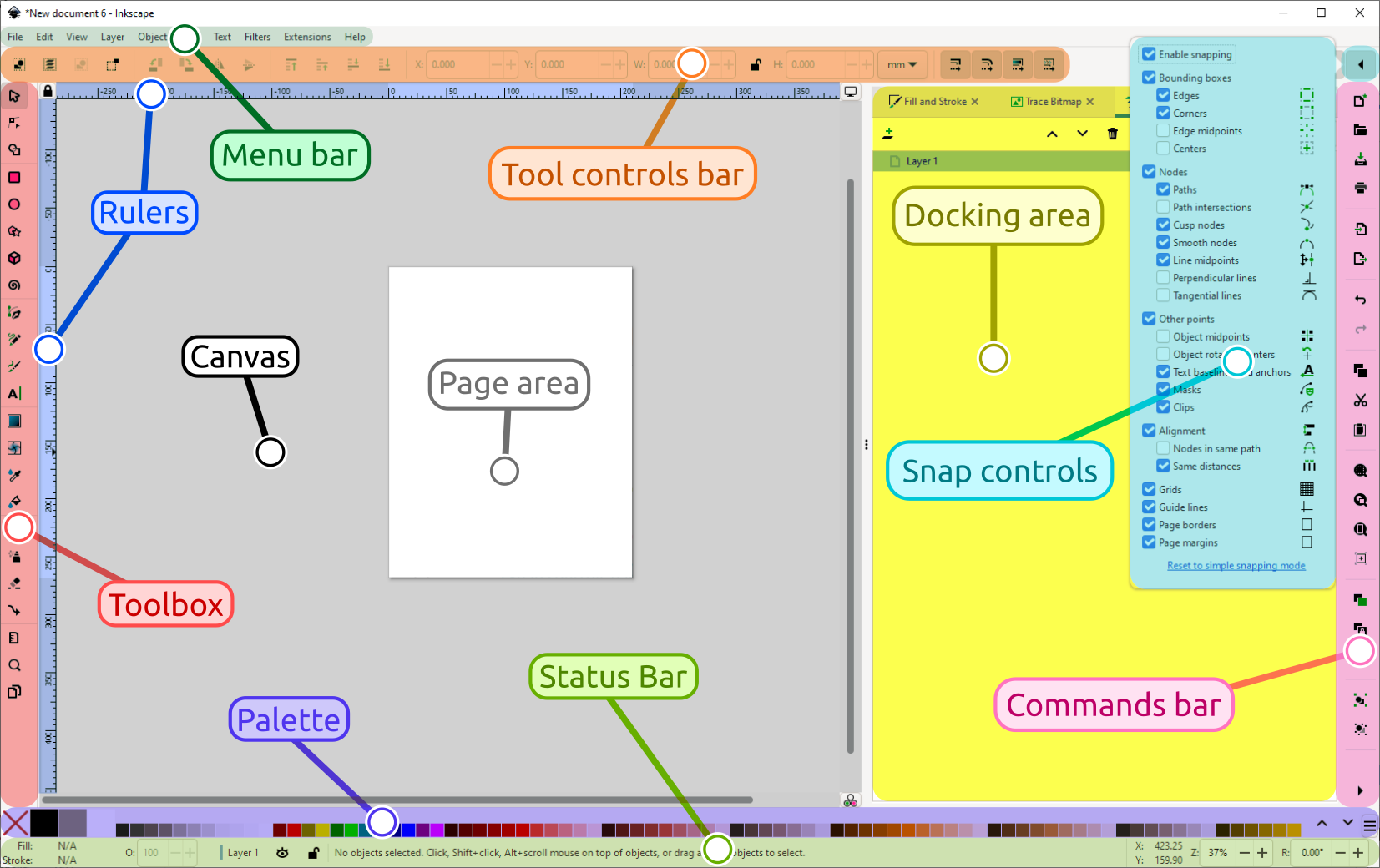
The main areas of the Inkscape user interface
The application menu bar along the top provides general menu options. Some are similar to other software programs (, , etc.). There are also Inkscape-specific items.
The tool controls bar just below adjusts to the currently selected tool. It displays adjustable options for the currently selected tool.
Vertically on the left, the toolbox contains the main drawing tools, e.g. for creating and editing shapes, as well as to zoom in and out. Only one tool can be selected at once.
The large blank area is the canvas, where the image is edited.
A white rectangle with a dark outline represents the visible page area.
On the right side of the window, there is another toolbar. This commands bar gives quick access to commonly used commands, which are also available via the dropdown menus. If not all the commands are shown, there is a right-facing arrow at the bottom, which gives access to the hidden choices.
In the top right corner, a little arrow next to a magnet symbol lets you access the snap controls. We suggest you deactivate snapping for now if they are active, by pressing the magnet symbol, or by pressing %.
There are rulers at the top and on the left of the canvas, to help with grid and guideline placement.
Scrollbars are available to the right and bottom to move around on the canvas.
The color palette is near the bottom of the window. Its most basic usage is to change the fill color of an object. See also The Color Palette.
At the very bottom, the status bar provides information such as the colors of the selected object, layers, cursor coordinates, zoom level and page rotation. It also contains a field where Inkscape can display helpful texts, such as the number and type of selected objects, or tips about keyboard shortcuts and usage hints. Whenever Inkscape doesn’t do what you think it should be doing, look here first.
Dialogs for specific functionality will by default appear attached to the right of the canvas, in the docking area.